
Version 1.1 is out now
On October 6th we released Version 1.1 to the App Store, this was a small update that fixed a few UI bugs that we had missed during the initial release as well as enhancing some of the existing features that we have. These changes were made based on observations and request from the small number of people that have downloaded the app. In our commitment to drive continuous improvements and the very best in customer service that we can possibly do I have worked diligently to make these updates at the earliest possible time. The full list of changes in Version 1.1 are outline below.
Made for twins and multiples
Today's Insights now show each baby's own feeds. Swipe between your babies on the Home screen and the figures follow.
Smart Insights are now personal to each baby, so feeding patterns, night stretches and routines are no longer mixed together.
The Feeding Frequency chart in Trends has a new baby picker.
Pumping and milk bank stats stay together as your own, whichever baby you're viewing.
A home screen that's more yours
Choose up to 4 baby panels and 4 parent panels for Today's Insights.
A redesigned Customise screen keeps everything in one easy-to-scroll list.
Easier logging
Tap anywhere in an entry box, including the "mins" or "ml" label, to start typing.
A newly added baby now appears straight away when logging a session, with no need to restart the app.
Fixes and improvements
Guidance article images now load reliably.
Articles containing long links no longer shift the page sideways.
Twins and Multiples were originally grouped together in the “Today Insight” stats
We really appreciate the feedback we have received so far and we are committed to building out the very best app for Parents. If you have any questions, requests or just feedback (whether it is good or bad) we would love to hear from you. Thank you for your support so far.
Patrick Hall
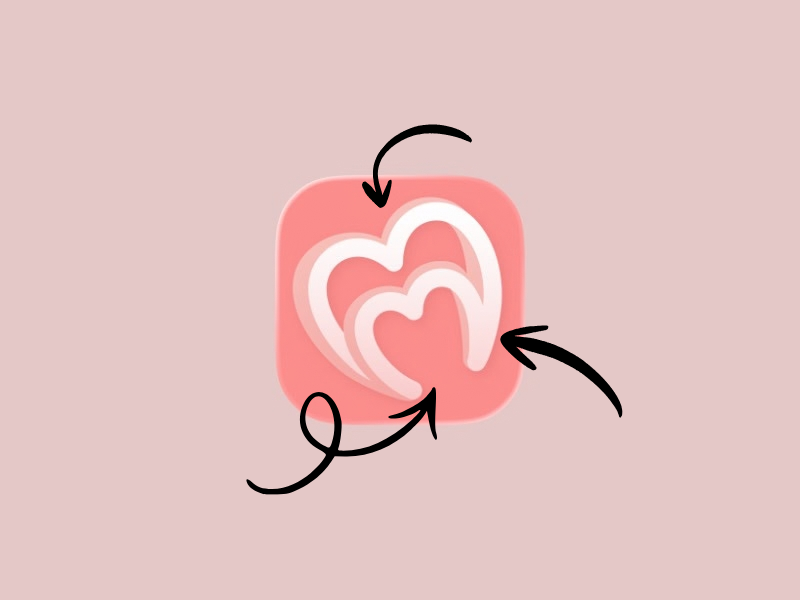
The story behind the Logo
When Amanda and I set out to design a baby tracking app with midwife-led support, one that helps you understand your numbers and your patterns, backed by fact-based education written by Amanda, we agonised over how to communicate that. The front door is obviously the app icon and logo. It's the very first thing you see when you browse the App Store or come across any of our socials, and it's your first impression of MilkMade.
MilkMade is an app you'll be using every day, often multiple times a day, so we wanted it to feel authentic and premium and, most importantly, like it belongs on your home screen. With that in mind, I want to walk you through our design process for the icon and logo, and explain why we did what we did.
The letter M
Because of the alliteration in the name MilkMade, we wanted to incorporate the letter M into the logo. Letter-based icons are synonymous with some of the biggest brands in tech, and that's something we wanted to emulate. We have big ambitions for MilkMade, and part of that meant including the M.
That being said, simply using the letter M, or stacking two Ms on top of each other, didn't sit right. A single letter can mean so many things, and we could easily have been confused with other big apps like Medium. Part of icon and logo design is doing something different so you stand out.
So I sketched. I drew the M in capitals and in lowercase, on sticky notes, whiteboards, scrap paper and notebooks. But the one that resonated was drawn on the shower screen door…
The love hearts
Most nights, I run the shower for my older two children and hand them their towels when they're done. My daughter gets full credit for the love hearts. She draws them everywhere, and one evening, as I was passing her a towel, I watched the way she drew a love heart on the shower screen and then wiped it away. It dawned on me: a love heart looks like an M if you don't connect the lines at the bottom. That was my "aha" moment.
I knew I had to incorporate a love heart, and from there it was just a matter of trialling different ideas: side-by-side hearts, an M inside a heart, a heart inside a heart with an M. You name it, I tried it. I showed Amanda a collection of what the logo and icon could look like (I'll admit I sanitised the list, because I was overly critical of some of them).
Then Amanda mentioned something about her hospital shifts: her patient load is effectively double what she's assigned. If she's looking after three women after birth, she's really looking after six people, because each one is a mother and a baby. That was the next "aha" moment…
Joining two hearts
A simple sketch linked two hearts at a single point, and suddenly it became a symbol: a parent holding hands with their baby. It felt right. The shadow on the hearts became incredibly important, because it's what shows that "holding hands" moment. This was it: the letter M, two hearts, and a connection that symbolises the bond between parent and baby.
It may seem simple (and in truth it is), but the icon and logo are a symbol of the effort we've put into this app. Every choice in MilkMade's design has been intentional and thoughtful, and designed to be frictionless for any parent who uses it. The logo is no exception. I'm incredibly proud of it and the way it came about, because it wasn't an afterthought. It was inspired by my family, and seeing it on people's phones is an achievement in itself.
Patrick Hall
We Launched!
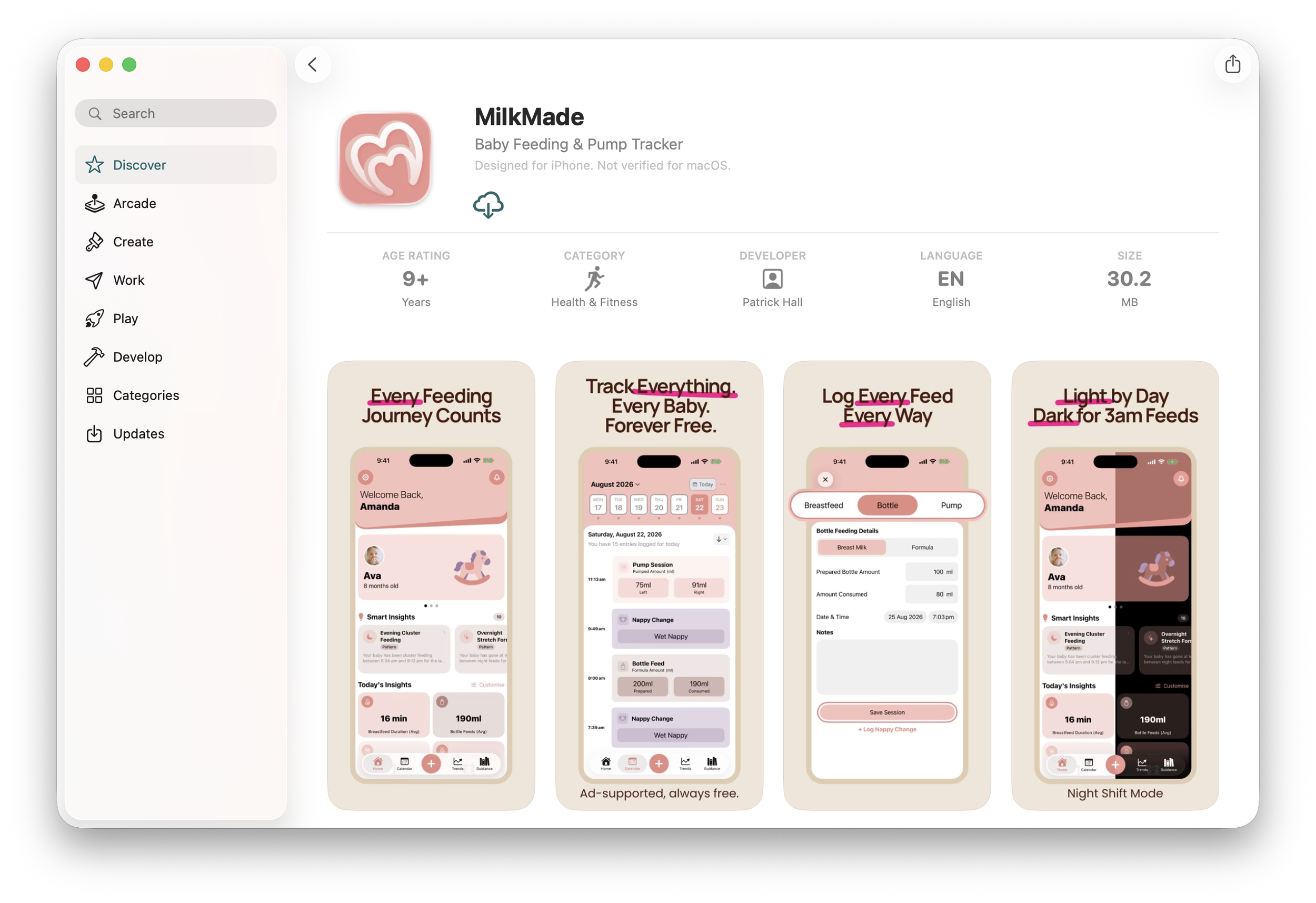
MilkMade Featured on the App Store
Today, September 17th 2026, after the culmination of 15 months of work, countless paper prototypes, an innumerable number of tutorials, hours of YouTube content watched, and tireless evenings studying Swift and SwiftUI, we have finally launched!
It is difficult to put into words just how much this means to us both, but for me personally, this is a dream I have had since my TAFE and university days. I have long aspired to build an app and release it out into the world, with the very goal of building something that genuinely helps people in need. I have dabbled in the arena of app development all these years with a burning desire to build a business. Nothing really stuck — half-baked ideas, my aspirations not meeting my talent or education, and a real lack of interest in what I was building, as I was stuck chasing "what is popular" trends. But in 2025, things changed. My son was born and spent 18 days in the NICU and Special Care, and everything surrounding him was tracked — feeds, bottles, nappies, oxygen levels, the list goes on. The midwives and nurses caring for him did so with such dedication, and the support they showed us was genuinely inspiring and reassuring. This is when ideas began to percolate, and with Amanda on maternity leave, our two worlds collided — an idea for an app blending with her expertise started to take shape.
My desire to build a business has meant that I've read countless books on business and marketing, and I've been inspired by the founders and builders who have achieved real success. But what inspires me most is that all the companies and founders I admire share an innate desire to provide the very best in customer service — helping their customers solve a problem, or offering a level of support that just can't be found through a Google search or bought from a retailer. I am making it my mission to build the very best app I can with MilkMade, and I hope that as I iterate on it, the features I build make the lives of those who use it better and less stressful. With Amanda's expertise and her desire to help mothers, babies, and families, I truly believe we can make a difference. Of course, if we've missed something, or there's a feature you'd like to see, I'd love to hear from you — so please reach out.
Thank you,
Patrick Hall (Co-Founder)
P.S. I initially penned this on the 17th, but I’m still getting used to this blog thing, so the 18th is when it was published.